Vous pouvez ajouter un texte d’introduction de plus grande taille à vos articles en enveloppant simplement un paragraphe dans une balise p avec la classe CSS « intro ». Pour faire simple, un texte plus grand sera généralement lu avant un texte plus petit.
Nous avons prêté beaucoup d’attention à la mise en place des bases de la typographie dans le nouveau thème WordPress Blog. Le but de cette page est d’aider à déterminer quels sont les paramètres par défaut avec CSS et de s’assurer que tous les éléments possibles sont inclus. Par exemple, nous avons examiné les titres. De beaux titres.
La mise en forme peut être ajoutée en enveloppant la première lettre du premier mot dans une balise span avec la classe CSS « dropcap ». Au lieu d’utiliser la police du corps du texte, nous utilisons la police d’affichage de nos titres. Cela permet également de lier les deux éléments entre eux si la police d’affichage s’accorde bien avec le corps du texte.openers. Vous pouvez également utiliser une police purement décorative. Il existe des milliers de polices de caractères décoratives, mais la plupart d’entre elles ne conviennent pas pour le corps du texte d’un livre.
Blockquotes are a great way to display and format quotations. Insert beautiful quotes using the “quote” button from the visual editor. To add an author just wrap its name in a cite tag.
Are you still making bulleted and numbered lists by manually typing bullets or numbers at the beginning of each line? In the 21st century, this is a task no one should be doing by hand.
- We took a good long look
- At
- Unordered
- Lists.
- Also we took a good look
- At
- Lists
- Of the ordered variety.
Heading Three
This tag styles large blocks of code.
pre {
    margin: 0 0 5px;
    font-weight: bold;
    font-size: 16px;
    line-height: 1.5;
}
Tables are useful for layouts where text needs to be positioned side-by-side or floating at specific locations on the page. If making these is frustrating with the usual layout tools, try using a table.
| Type | Font | Description |
| Humanist | Sabon | Closely connected to calligraphy |
| Transitional | Baskerville | More abstract and less organic |
| Modern | Bodoni | Note the thin, straight serifs |
| Slab Serif | Clarendon | Egyptian typefaces have heavy serifs |
To highlight a text, you simply need to wrap it into a <span> with the class “highlight”. This can be done in the Text editor view.
Two Column Layout
To split the text in a two columns layout you simply need to wrap it into a div container with class “twocolumn”. Having multiple columns allows for a very versatile ad grid, and, traditionally, newspapers were in the business of selling ads.babies in slings around front.There is a general rule that one line of unjustified text should have around 9-12 words. For justified text these numbers are around 10-15 words. Since some words are longer and some shorter this is not a perfect measurement. Small columns of text are easier to read than large ones. Imagine a newspaper sized line that stretched across an entire page. It would be very easy to skip a line. For justified text these numbers are around 10-15 words. Since some words are longer and some shorter this is not a perfect measuremenYou must ask yourself how to easily achieve these numbers? Don’t worry it is easy, you won’t have to count the characters one by one.
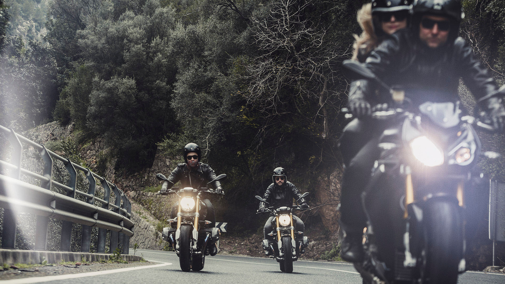
Image Styles
Welcome to image alignment! The best way to demonstrate the ebb and flow of the various image positioning options is to nestle them snuggly among an ocean of words. Grab a paddle and let’s get started.
The rest of this paragraph is filler for the sake of seeing the text wrap around a right aligned image.
As you can see there should be some space above, below, and to the left of the image. The text should not be creeping on the image. Creeping is just not right. Images need breathing room too. Let them speak like you words.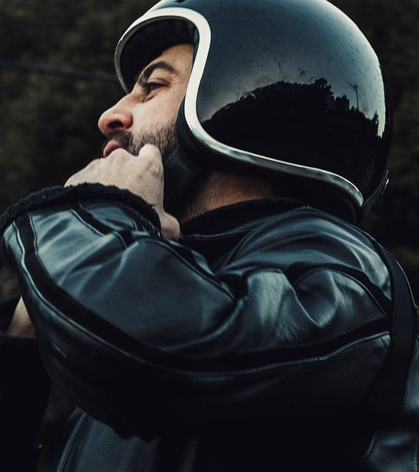 As you can see there should be some space above, below, and to the left of the image. The text should not be creeping on the image. Creeping is just not right. Images need breathing room too. Let them speak like you words.
Let them do their jobs without any hassle from the text. In about one more sentence here, we’ll see that the text moves from the right of the image down below the image in seamless transition.
Don’t let anyone else tell you differently. In just a bit here, you should see the text start to wrap below the left aligned image and settle in nicely. There should still be plenty of room and everything should be sitting pretty. Yeah… Just like that. It never felt so good to be right.
Let them do their jobs without any hassle from the text. In about one more sentence here, we’ll see that the text moves from the right of the image down below the image in seamless transition.
And now we’re going to shift things to the left align. Again, there should be plenty of room above, below, and to the right of the image. Just look at him there… Hey guy! Way to rock that left side. I don’t care what the right aligned image says, you look great.
Credits to Laurent Nivalle.
Don’t let anyone else tell you differently. In just a bit here, you should see the text start to wrap below the left aligned image and settle in nicely. There should still be plenty of room and everything should be sitting pretty. Yeah… Just like that. It never felt so good to be right.
And that’s a wrap, yo! You survived the tumultuous waters of alignment. In just a bit here, you should see the text start to wrap below the right aligned image and settle in nicely. There should still be plenty of room and everything should be sitting pretty.